Transportation payment app
Easy Wallet

Helping people to use the Easy Wallet, an app based on Easycard, like they are using the physical card.
Problem
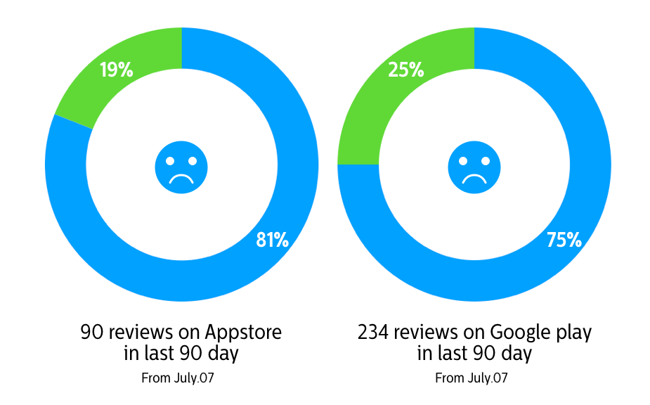
First off, I did some product research; analyze the rating on the appstore and google play.
There are some differences between this two system. Android version does have NFC function, actually just named as Easy Wallet NFC. But IOS version doesn’t.
Step 1
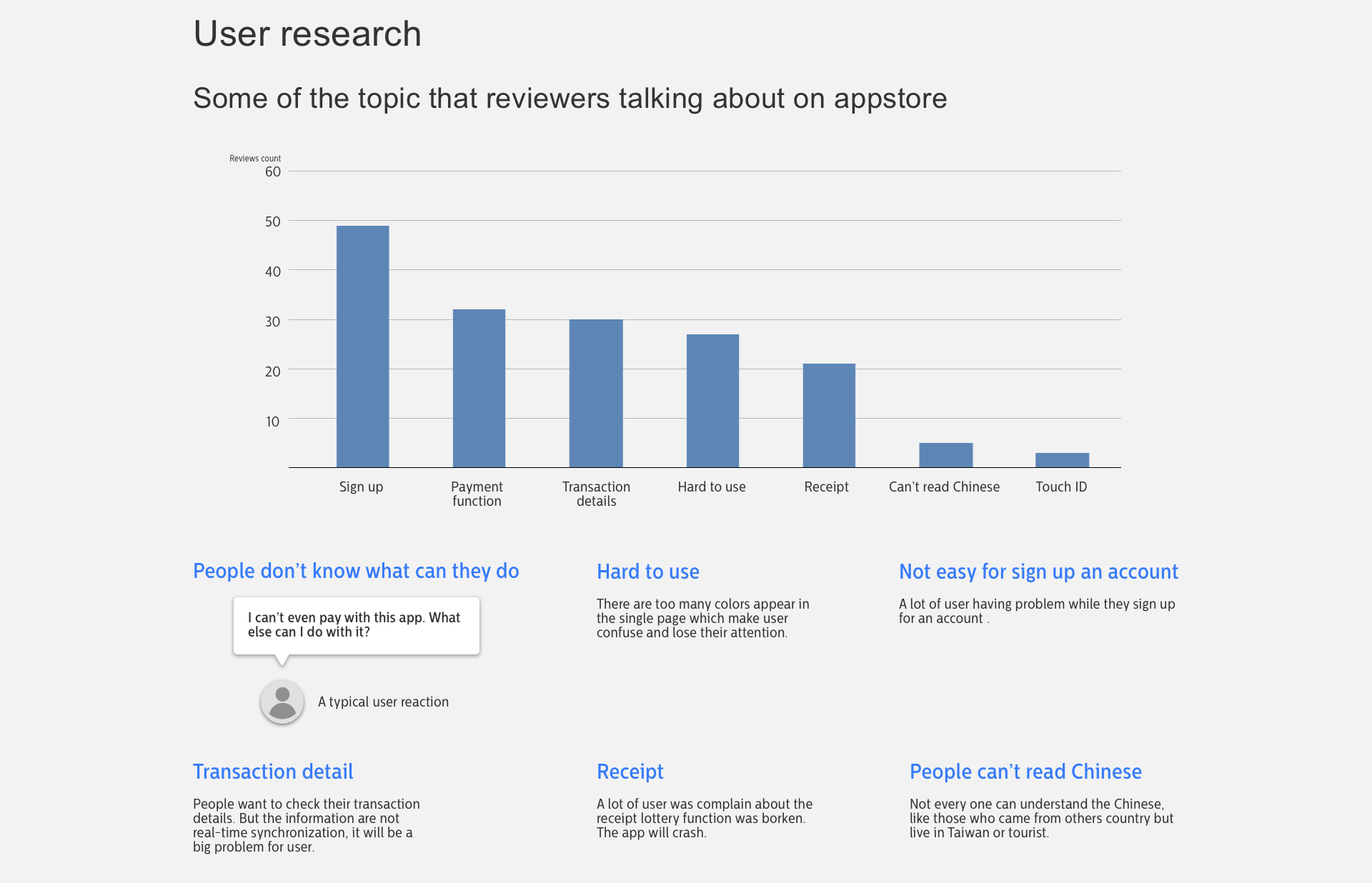
Product research
There are some differences between this two system. Android version does have NFC function, actually just named as Easy Wallet NFC. But IOS version doesn’t.
Step 2
Allocate the problem
some of the pain points showing in research process that were more like technical issue, like the app will crash while using the receipt lottery function. So I decided not to focus on this kinds of problem in this case
Step 3
The core user needs
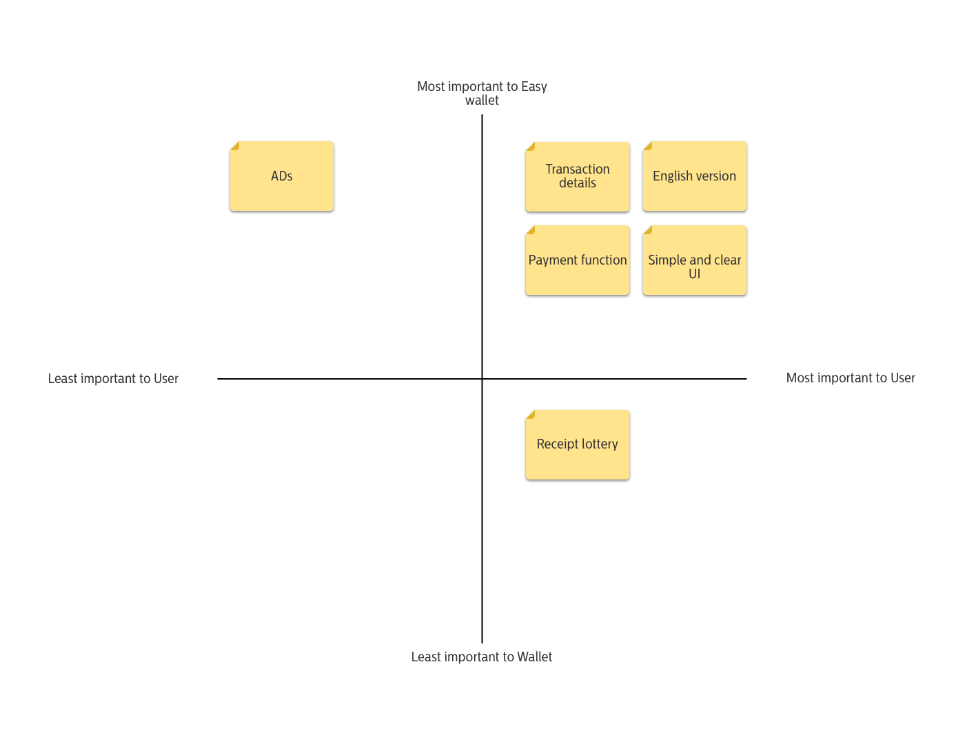
Some of the primary issues that popped out was-what is the main purpose while using this app? For pay? For recording the transaction? And who is the target user? Therefore I decided to tackle the four pain points that are both important to user and Easy Wallet.
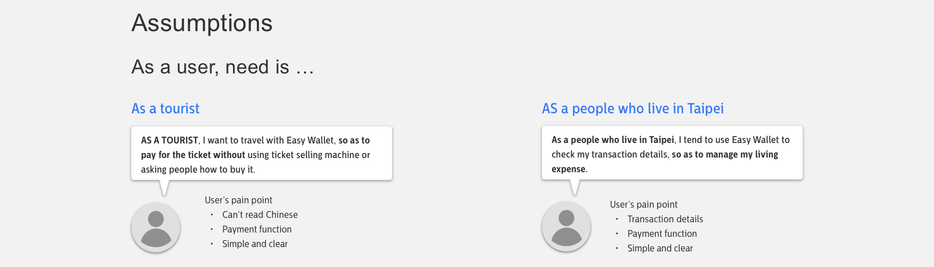
Primary issues
- People don't know what can they do with this app
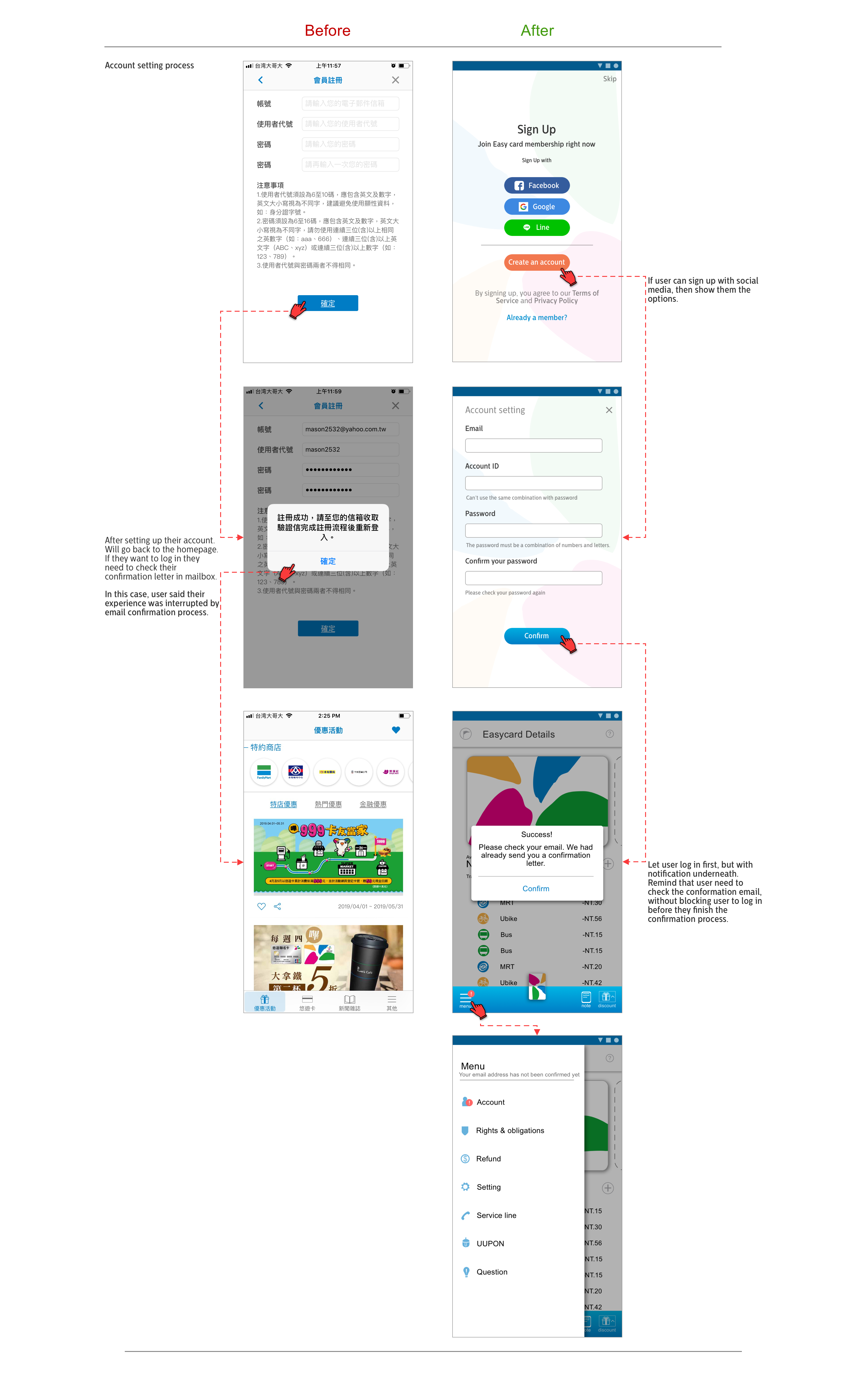
- Not easy for sign up an account
- Transaction details are not real-time synchronization, and lacks of readability
- Some people can't understand the Chinese
The solution, the goals
According to the result of the research, I learned the goal that user want to achieve.
- Add a Payment function into the app
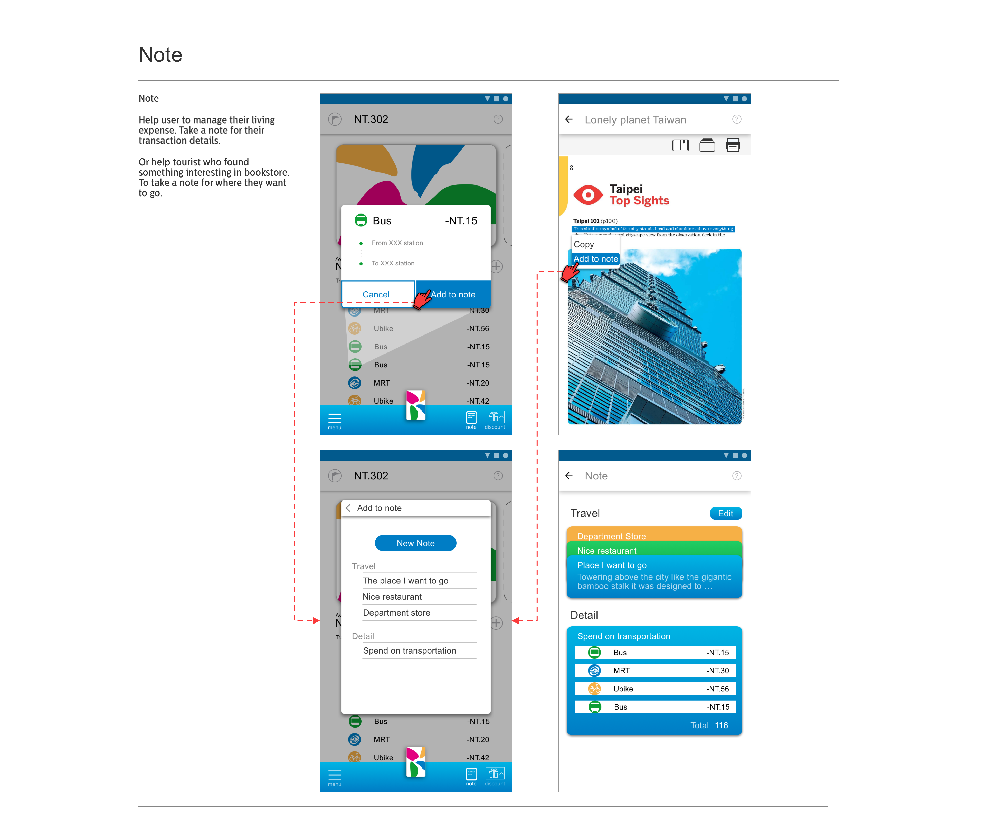
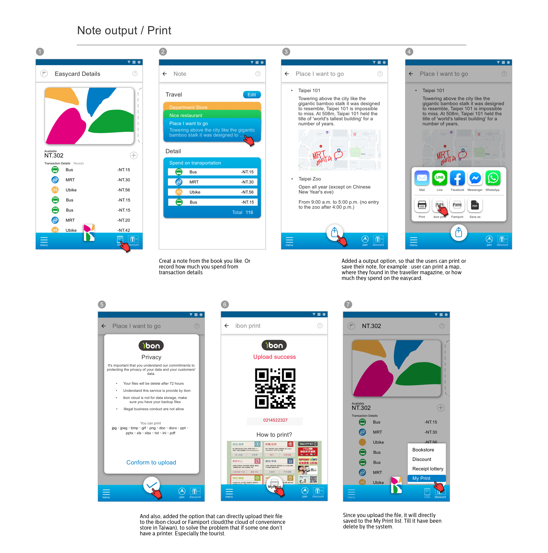
- Add an Output function into the app
- Make user friendly for foreigner who can't understand the Chinese
- Make transaction details looks clear and simple
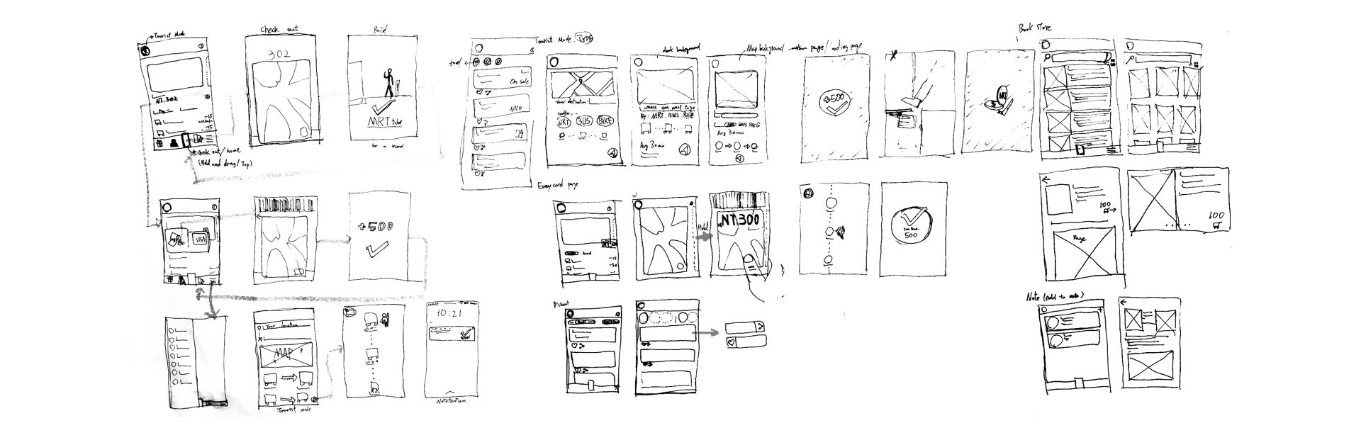
Early phase of design process, define the problem with single features.
Iteration & Results
According to the result of the research, I learned the goal that user want to achieve.
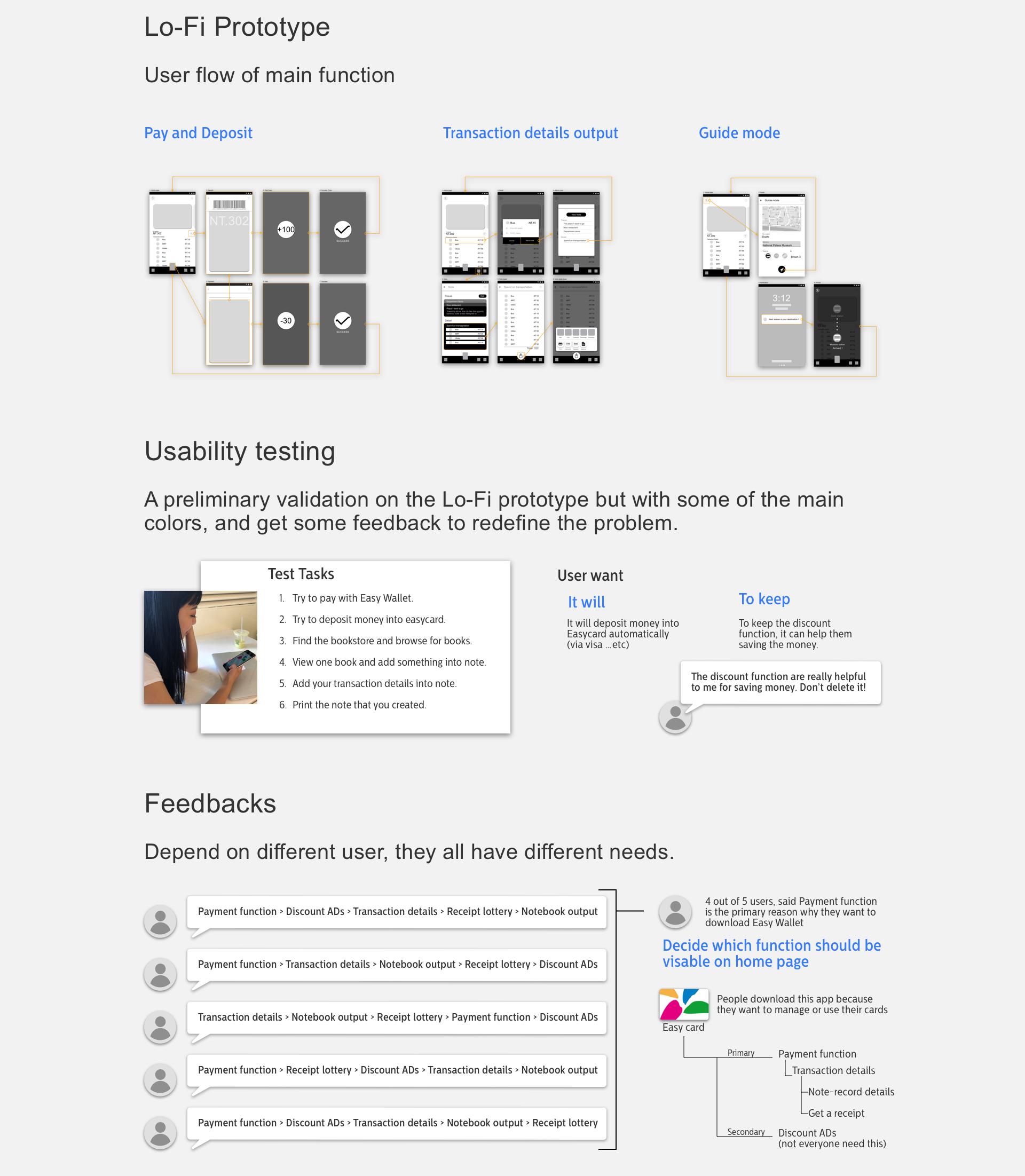
After the usability testing, it was discovered that people don’t like the original version because of what it lacks, not because of the functions it already has.
In other words, people like the discount news, the bookstore, and receipt lottery function…etc. However, people want to use the Easy Wallet, an app based on Easycard, like they are using the physical card. This would make people place more attention on the card itself.
It would also bring back some of the functions that I had deleted in the Lo-Fi prototype phase, including discount news. People liked this because it can help them save money.
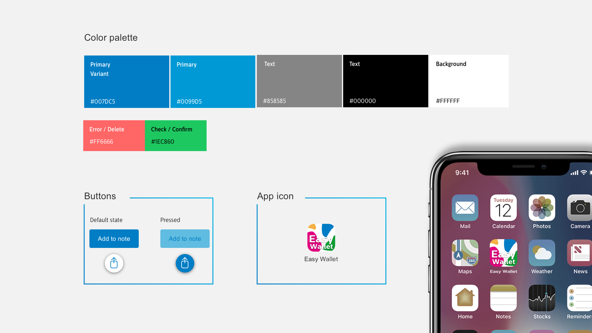
The interaction
It is all about Easycard. Make user feel they are using the "card".

Takeaways
To Taipei citizen, Easy card have been a part of our life.
Most of the user thought it definitely include some kind of payment function or else, before they download the Easy Wallet. But the truth is the Easy Wallet got 845 rating count on appstore in last 365 days, but there have 562 people gave it a “1 star” rating. Although it is good to bring physical card user to digital world. But Easy Wallet is losing their user. On the latest update, they deleted their bookstore function. User reviews point out that Easy Wallet is losing their user again. People don’t use it because it just can’t achieve their goal. It doesn’t use like what it named to be, the Easy Wallet, a Wallet.
This project helps me to realize that how important the core function of our product is. Does it clear or not? Can it save our times? Can it achieve user’s goal? If it couldn’t, no matter how fancy the UI will be, or how many additional function it includes. User won’t buy it. We, designers must take user's problem as our problem as well. Satisfying the user’s needs is why the product exist.